
The One-Second Rule: Why Logo Reveals Shrank from 6 Seconds to 1
Logo stings used to take six seconds. Today clients want the message on screen in one. A template designer on how social feeds rewired motion design, and how to plan an animation around its first second.
A few years ago, a six-second logo sting was simply how things were done. Particles drifted in, light swept across the screen, the mark assembled itself piece by piece, and then it sat there for a couple of seconds so nobody could miss it. Today, if a client opens a preview and nothing readable appears within the first second, the feedback arrives almost word for word: "Can you make it faster?"
I have designed and sold motion graphics templates on stock marketplaces for more than a decade, and this request has quietly become the most common note I get. Here is how we got here, why short is harder than it looks, and how I now plan an animation around its very first second.
When six seconds felt normal
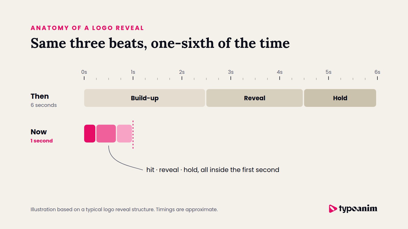
Classic intros were built for an audience that had already decided to watch. Someone had pressed play on a video, a presentation or a TV spot, and a slow opening felt like a curtain going up. Designers had room to tell a small story: a build-up, a reveal and a hold, each lasting about two seconds.
That structure still works when the viewer is committed. The problem is that most viewers no longer arrive that way.
The feed changed who holds the remote
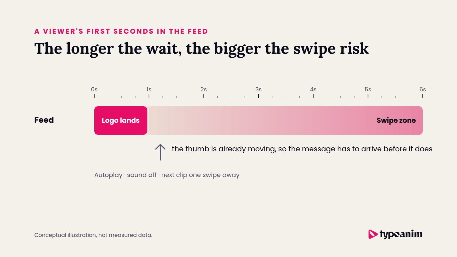
Stories, Reels, TikTok and YouTube Shorts turned viewing into something closer to flipping through a magazine at full speed. Videos start on their own, sound is often off, and the next clip is one thumb movement away. The viewer did not choose your video; it simply showed up, and they are deciding in real time whether it deserves to stay.
In that setting, a slow intro is not a warm welcome. It is an invitation to leave. Anything that delays the actual message, whether it is a long logo build or a lingering title, competes directly with the swipe.
Why clients keep asking for speed
From the designer's chair, a long reveal is tempting. It is the place to show craft: timing, camera moves, little surprises. Clients look at the same animation from the other side. They are paying for attention, and every second the logo spends assembling itself is a second the audience is not hearing what the brand has to say.
So the brief has shifted. The logo is treated less like the main act and more like a signature: clear, confident and over quickly, so the content can start.
The logo is no longer the show. It is the signature at the bottom of the letter.
A strange split between what sells and what gets used
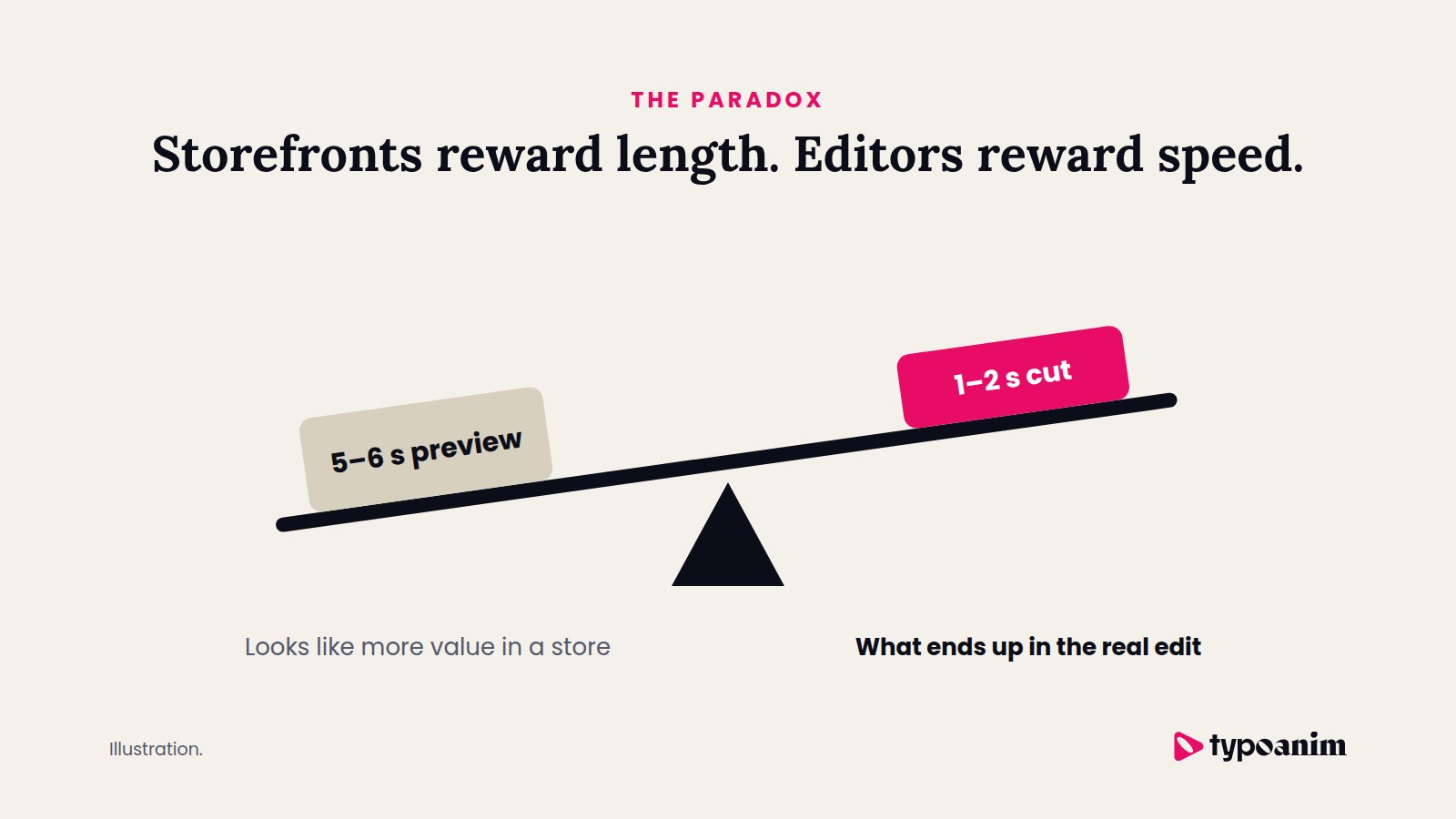
There is an odd tension in the template business. On large marketplaces, longer previews often look more "valuable". A five or six second animation simply has more to show, so it can feel like more product for the money.
The people who actually put those animations into real projects tend to do the opposite. They trim the build-up, speed up the reveal and cut the hold down to a beat. In other words, the storefront rewards length, while the edit rewards speed.
Short does not mean easy: the frame budget
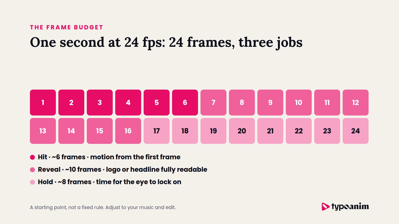
Cutting an animation to one second does not cut the work. It usually doubles it. At 24 frames per second, one second gives you exactly 24 frames, and every one of them has a job.
A rough budget I use as a starting point:
- Hit, about 6 frames. Something must move on the very first frames, otherwise the clip looks frozen in the feed.
- Reveal, about 10 frames. The logo or headline becomes fully readable. Strong easing does most of the storytelling here.
- Hold, about 8 frames. Just long enough for the eye to lock on before the content takes over.
With so few frames, there is no space for decoration that does not carry meaning. Ideas have to be compressed until only the clearest gesture is left, which is a design problem, not a shortcut.
How I plan an animation around the first second
These habits have changed the way I build templates, and they work just as well for your own projects:
- Design the final frame first. Decide what the viewer must read, then animate toward it instead of away from it.
- Put something readable on screen early. A word, a shape or a color block in the opening frames tells the viewer this clip is worth a moment.
- Build it so it can stretch. Use markers and keyframes that scale well, so the same animation can run at one second for Reels and three seconds for a YouTube intro.
- Test it the way people watch. Preview on a phone, with the sound off, at full speed. If it only works on a big monitor, it does not work.
- Offer a short cut. When a longer version exists, a trimmed one next to it saves the editor time and usually becomes the one they use.
Quick check: pause your animation at the one second mark. If a stranger cannot tell what the brand or headline is from that single frame, the animation is still too slow.
Where motion design goes from here
If the trend keeps going, the classic intro may disappear almost completely. Brand moments are already moving inside the content itself: a logo that slides into the corner while the video plays, a title that appears on the beat of the music, a color that carries the identity instead of a separate opener.
That is not the end of motion design. It is a shift from ceremony to rhythm. The skill is no longer stretching an idea across several seconds, but finding the one movement that says everything in a blink.
The short version
Animation got faster because attention got scarcer, and the feed made that impossible to ignore. For designers and editors, the job is the same as it always was, to make people notice and remember, just with far fewer frames to do it. If you want ready-made logo animations and titles to adapt to this pace, you can browse the Typoanim library and trim them to fit your edit.
— Aliyar